Castle
UX/UI Case Study
Role
Research, Ideation, Copywriter, User Testing
Timeline
October–December 2018 (8 Weeks)
Team
Tools
Markers & Whiteboards, Sticky Notes, Figma, Sketch, Illustrator
Project Summary
Mobile phone data plans in Canada are very small and very expensive which provides the space for the Castle app to exist which is Wi-Fi sharing app that enables cheap, fast, and secure Internet.
Check it out here → Final Figma Prototype
The Problem
Canadians are spending more and more of their lives on mobile devices when not on home or work Wi-Fi. The lifeblood of using these devices is, of course, mobile data. Thanks to the oligopoly of “the big 3” that data remains very expensive and monthly allowances remain frustratingly small.
At the same time, Wi-Fi networks are prevalent in many areas providing internet data that is relatively cheap, faster speeds, and has greatly higher bandwidth allowances available.
How can we help bridge this gap between providers of fast, cheap Wi-Fi with consumers who want that same product?
The Process
For this project, we got to experience an end-to-end waterfall model of designing an app. This means we gathered the requirements from the brief, analyzed the design goals, performed research into similar desgin solutions, the audience, and others, followed by development of a solution, and then testing that solution with user-testing sessions.
Project Definition
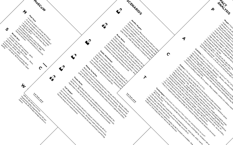
After the idea was brainstormed, the next step is a series of project definition steps. The first was a PACT analysis, which identifies the key users through breaking things down into people, activities, context, and technology. The second was scenarios, which are fictional but plausible user profiles as they interact with the app. Lastly, is to define requirements which prioritizes the app’s features usually through the MoSCoW method or similar.
Benchmark Analysis
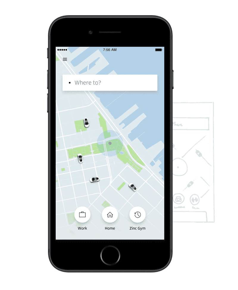
Once the project was defined, a benchmark analysis was performed. This was an important step that gathered research from other similar designs and analyzed them for their visual design, navigation, interactions to see if they could work for the app we were designing. For example, one of the apps we found was similar to ours was the Uber app. We determined that having a opening screen with a large map emphasized the interaction to connect and explore which would increase engagement to our app and service.
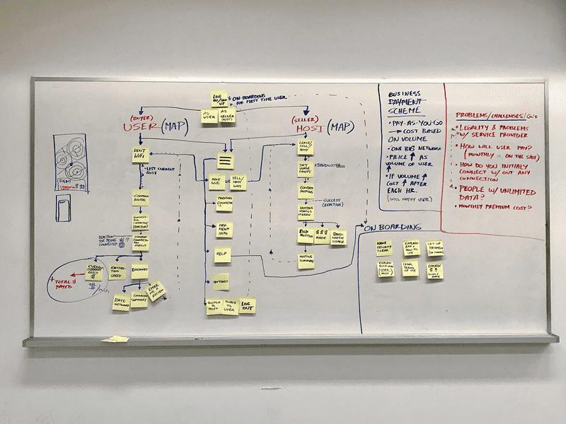
Interaction Maps
One of the best tools for determining the screens and interactions we needed to make the design work was an simple interaction map made with sticky notes and markers. This map specifically helps organized the consumption and provider sides of the app; similar to AirBnB’s model. Interaction maps are a great way of finding the business model as well but is indispensable for the next step, prototyping.
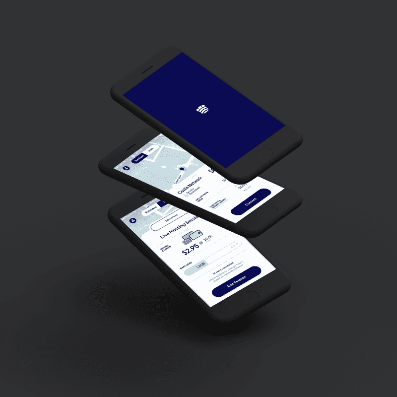
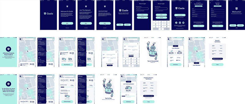
Prototyping
After all of the preparation, research, analysis, vectors are put to the artboards! Here we applied what we learned and created a prototype to help users connect to the service quickly, easily, and without too many pain points. We went through a few revisions and ideas but quickly the main prototype was ready to be user tested on our audience.
User Testing
The first real test of our app design is user testing. Here we tested the prototype with three individuals who all had valuable and sometimes unexpected insights into the current design. For example, one user knew that they could also sell Wi-Fi as well as buying it but couldn’t determine how to do that. In that prototype we included a fly-out drawer with many additional options but it wasn’t immediately obvious. Overall, the user testing was invaluable and should be done as soon as possible to reorient future design refinements toward serving actual users much better.
Refinements
There were countless refinements between the prototype we user tested and the final design for the service. Here are some below —
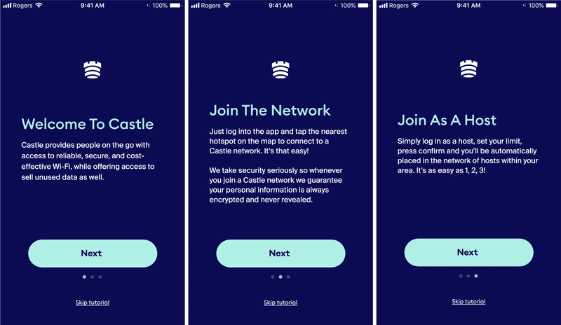
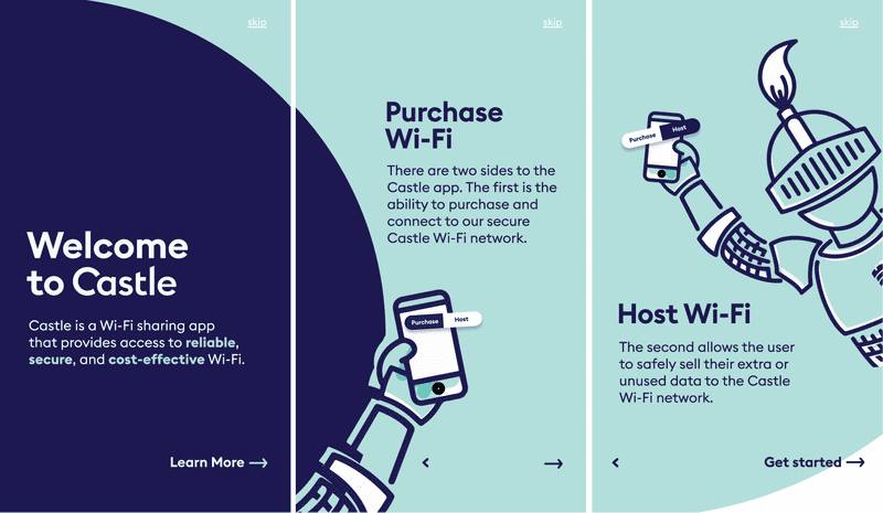
The first refinements went to the onboarding experience with a much more engaging visual design and workflow with only the essentials to get people going.
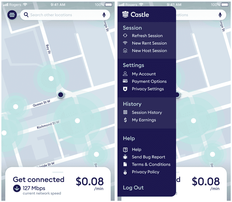
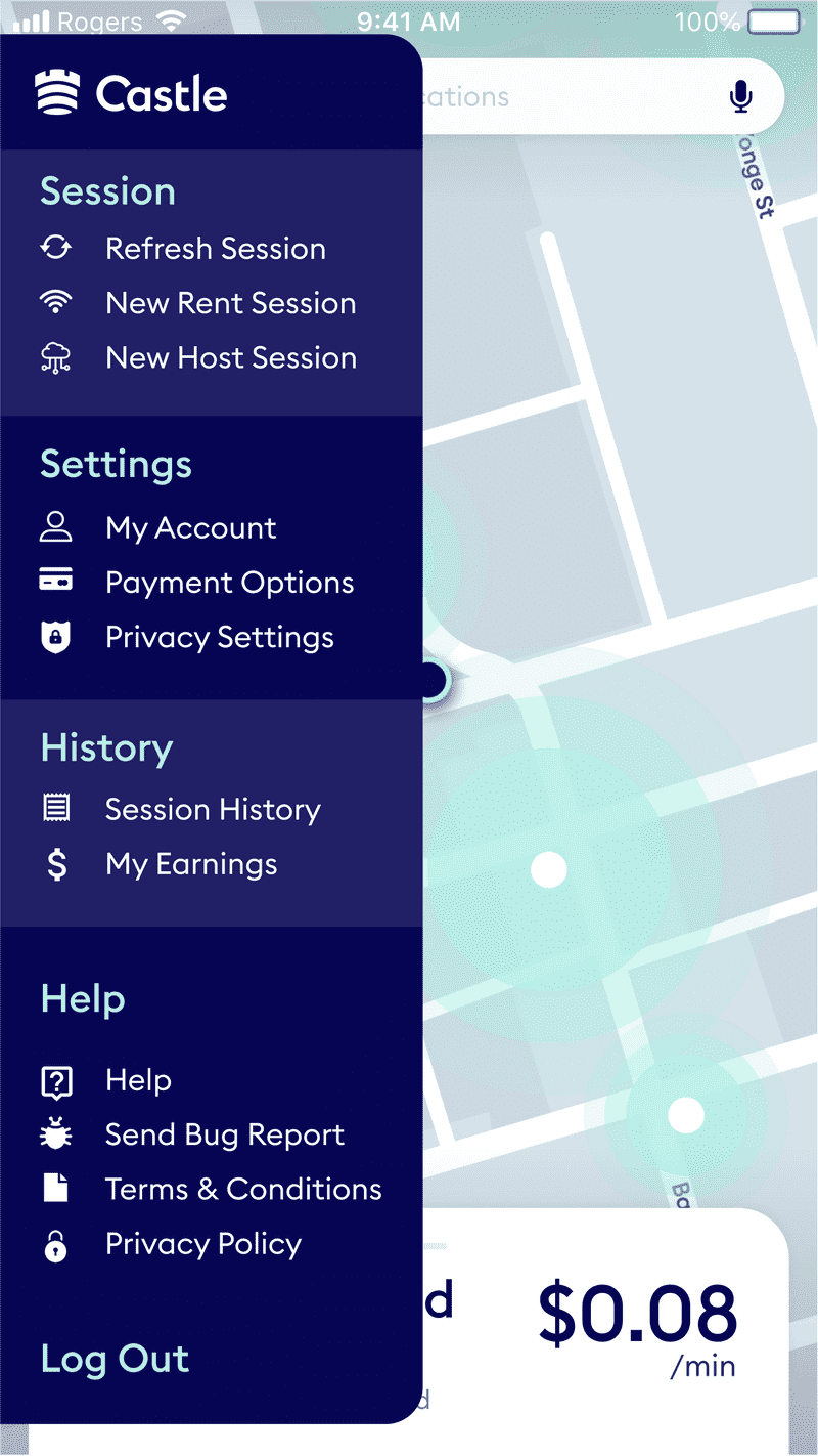
The second set of refinements went the secondary actions screens. For the first prototype we used a side drawer metaphor to list the additional actions. This didn’t work during the user testing so this lead us to implementing an overlay which organized things much more cleanly and adding a findable toggle to the top.
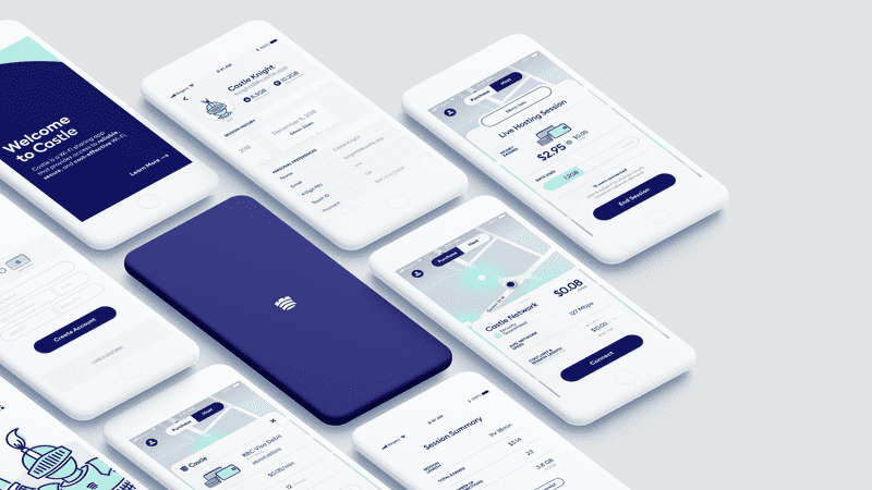
The Solution
The original problem we wanted to solve was that Canadians only have expensive and limited data plans available to us as consumers. This app addresses that problem and adds several other features to promote app growth and retains users.
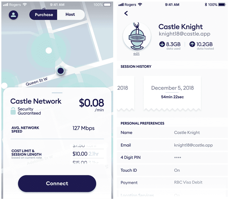
One decision we made based on feedback was to separate the buying and selling of Wi-Fi data into two sections of the app. For buying Wi-Fi, the user wants to connect quickly and easily and accomplish their task. For selling Wi-Fi, analytics about other users’ use and how much money they’ve made came to the forefront of the design.
The biggest takeaway from this process was the value of user testing on a wide diversity of people in your audience. For example, this app had an audience of mobile device users between the ages of 16 to 65. Addressing that large age range through one user experience was challenging. Luckily, we were able to test the prototype with a wide range of ages and that enabled us to change the app’s UI/UX to address those needs.