Homeward
Device Companion App UX/UI Case Study
Role
Research, Ideation, UI Design, UX Design, Prototyping
Timeline
November–December 2018 (5 Weeks)
Team
Tools
Procreate, Sketch, Illustrator, Sketch Mirror
Project Summary
With people living longer comes with new challenges. One of those challenges is memory loss from illnesses such as Alzheimer’s Disease (AD) and Dementia. One of the effects is patients tend to wander from their care facilities. This device and app companion seeks to gently guide these people back home quickly and safely.
Check it out here → Final Sketch Prototype
Background
The world population is getting older. Our parents and grandparents are also living longer. With that comes new challenges in medicine and society. How do we best care for people who can no longer perform all of the tasks they used to? Those who need around the clock care? Those who have memory loss?
One of the symptoms that arises as a result of dimentia, Alzheimer’s Disease is that patients tend to wander. The science is still on going as to why these people wander but when these people realize they are not in familiar territory it is very stressful.
Rather than being picked up by a emergency worker, such as a police officer, fire fighter, or ambulance, a better option is to gently be guided back to their residence by a device and companion app. This solution seeks to locate the person by GPS, let them talk to a caregiver via the app, and guide them gently back home.
The Process
This project was completed for the course “YSDN 3006 — Advanced Models and Speculative Interfaces - Visual Interaction Design.” A course focused on generating new data visualization models past the usual bar charts, pie graphs, and other excel templates. The brief for the project was to produce an internet connected device that has a mobile companion app.
Product Features & Attributes
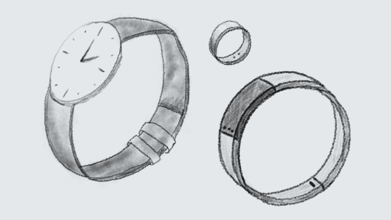
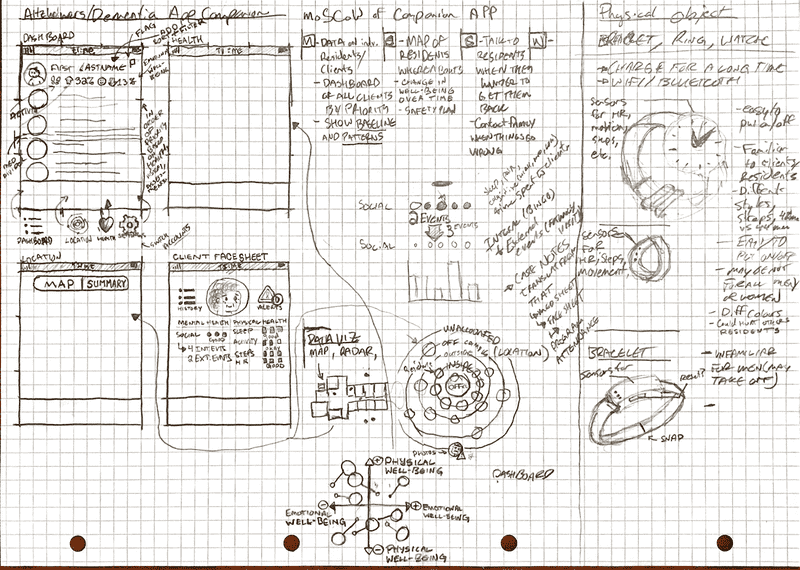
People with dementia tend to wander. The physical product is a activity tracker that is worn on the wrist (as a watch or bracelet) or on the finger as a ring; whatever is the most familiar to the resident. The physical device will collect data such as heart rate, activity (motion, steps, etc.), sleep data, and location. This device will also have a speaker and microphone for two-way communication to and from the resident to the caregivers.
That data is collected then processed and visualized in the companion app to give the caretaker the most important and accurate representation of their residents’ emotional and physical health to lessen the changes of wandering but also to deal with the wander when it occurs.
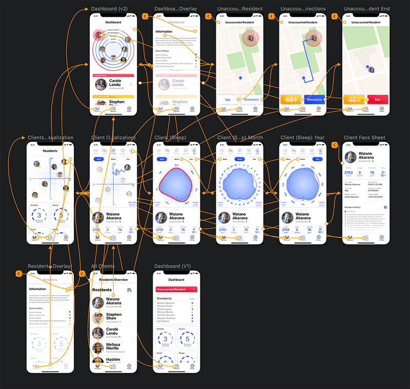
Initial sketches, lo-fi wireframes
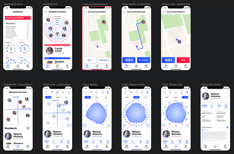
The main data visualization is an atomic model of people’s safety. If you remember back to high school science, the Rutherford model acts as a conceptual basis behind the visual. The further the resident is from the center the more attention is deserved by the caregivers.
The secondary visualization is a modified scatter-plot. The resident’s health is represented on x and y axes showing the emotional well-being on the x-axis and the physical well- being being shown on the y-axis.
The tertiary visualization is a series of radar charts to display the resident’s changes over time and the caretaker can adjust things if necessary.
Visual Research
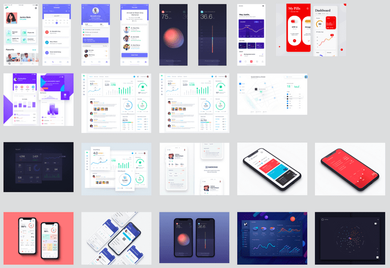
For the visual research, I scoured dribbble and Bēhance for ideas and general feel of healthcare and medical apps. I generally found lighter colour schemes with blues and corals and purples being dominant highlight/action colours.
Prototyping
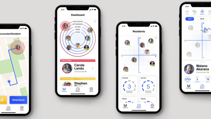
This is how the app looked when presented to the class on 2018-11-29. Since I lost a week due to travel, this was the first time I got real feedback on the visual models and processes I used inside the app.
Overall, it went well (even though I was in the throws of a pneumonia haze at the time). There were a few things that needed to be changed but the UI and UX were generally well received.
The feedback was invaluable to change the thinking I had at the time of making the app prototype. Another eyes are necessary for design; the more sets of eyes, the better the design will be.
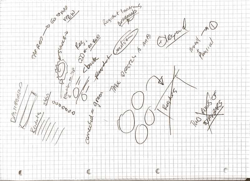
Refinements
There were a few things that I needed to shore up for the final submission. To the right are the notes I took during the presentation.
Some of the things that I needed to change were throwing out the dashboard for the main visualization screen, making the missing resident more prominent, and adding legends.
The Solution
I made quite a few refinements and changes to the V1 design. The most major being the dashboard change. This dashboard shows the caretaker more quickly what they need to know.
I changed the colour indicators so they were more clear with explanations being found in the information button.
The all residents pane has been taken out in favour of just touching the graph for the resident you want or using the dashboard screen if you know their name.
I also decided to keep the double navigation. Yes, yes, it’s bad form but I defend it by saying that it is the clearest and quickest way of navigating between those patient’s graphs.