Apple Watch Companion Apps Rethought
UX/UI Case Study
Role
Research, Ideation, UI Design, UX Design, Prototyping
Timeline
October–November 2018 (2 Weeks)
Team
Tools
Dot-Grid Pad, rOtring 600, Sketch, Illustrator, Sketch Mirror
Project Summary
The Apple Watch deeply integrates with iOS with the user interfacing mainly with three apps: Health, Activity, and Watch. This quick project reinterprets the data for some of the features of these apps to make them more helpful for users and their health.
The Product
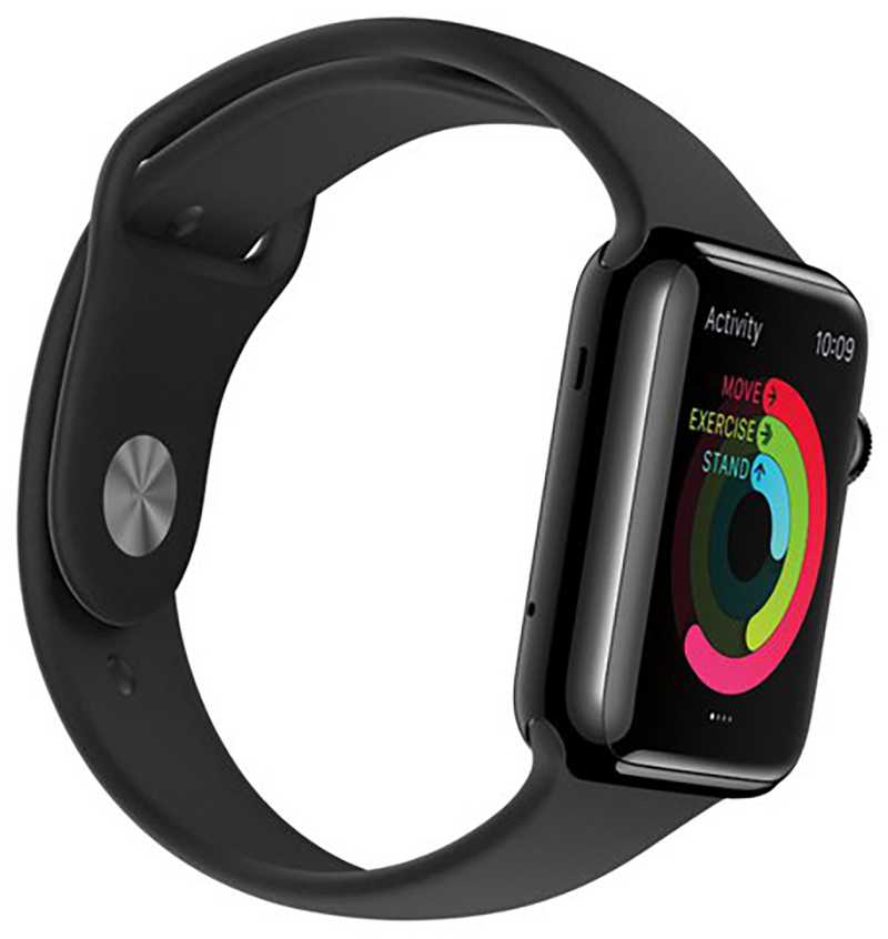
Apple Watch is a line of smart watches designed, developed, and marketed by Apple Inc. It incorporates fitness tracking and health-oriented capabilities with integration with iOS and other Apple products and services.
First introduced in April 2015, there have been four hardware and software revisions—each time adding additional functionality such as water-resistance, cell connectivity, and an EKG.
Apple Watch exists in a technology sector known as wearables. Wearable Computers are small computing devices that are worn under, with, or on top of clothing. Wearables can be for general use or for specialized purposes such as fitness trackers. The Apple Watch collects a lot of data from its wearer with help from the attached iPhone. These data include — Steps, Activity (Move, Exercise, Stand), Stand Hours, Exercise Minutes, Workouts, Flights Climbed, Sleep Analysis, Heart Rate, and more.
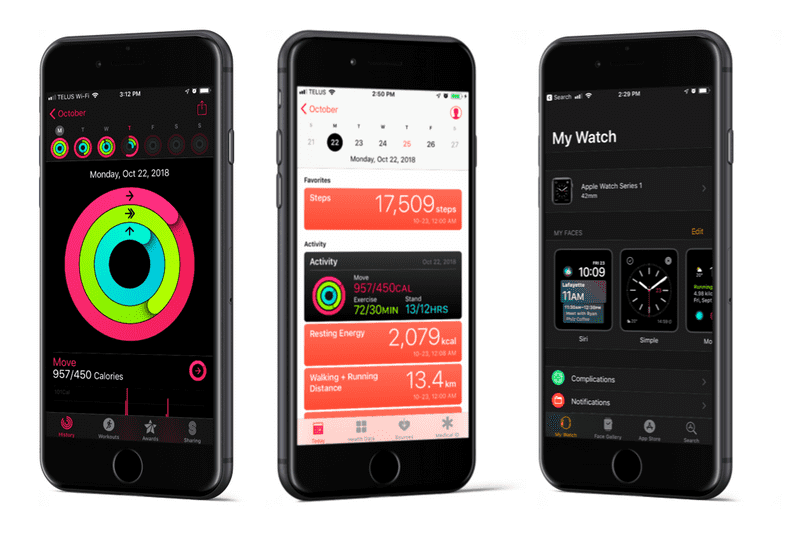
The Companion Apps
The Apple Watch has three companion apps. They are: the Watch app, where users can set up the watch, configure watch faces, and add apps; the Activity app, where users can see their daily progress, workouts, and achievements; and the Apple Health app, where users can access all of their health data, see their data over time, and set up their medical ID.
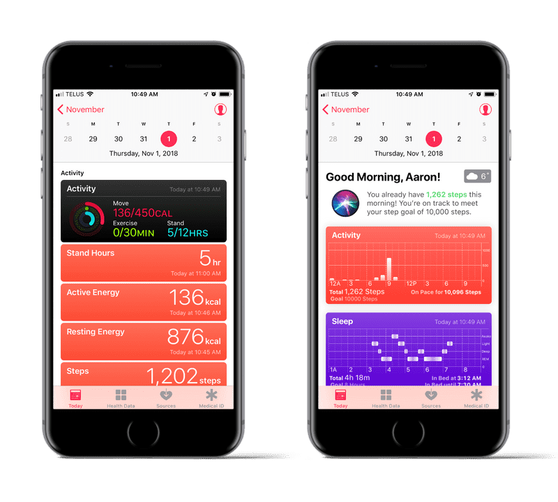
Today Redesign
The current design for the Apple Health today screen is just the data. Whatever the health app gets hooked to, it displays it with little insight or priority.
For the redesign, I wanted to add some insight, goals and categorization to the Today screen. The first section shows personal insight into the user’s health. For example, it could show that they are on pace to meet their activity or steps goals, or, the app could give people insight into maintaining their long-term mental health by having a consistent sleep schedule when they didn’t meet their sleep goals. Other goals can be added such as nutrition, workouts, or weight. Other insights could include heart health, weight fluctuations, or nutrition proportions.
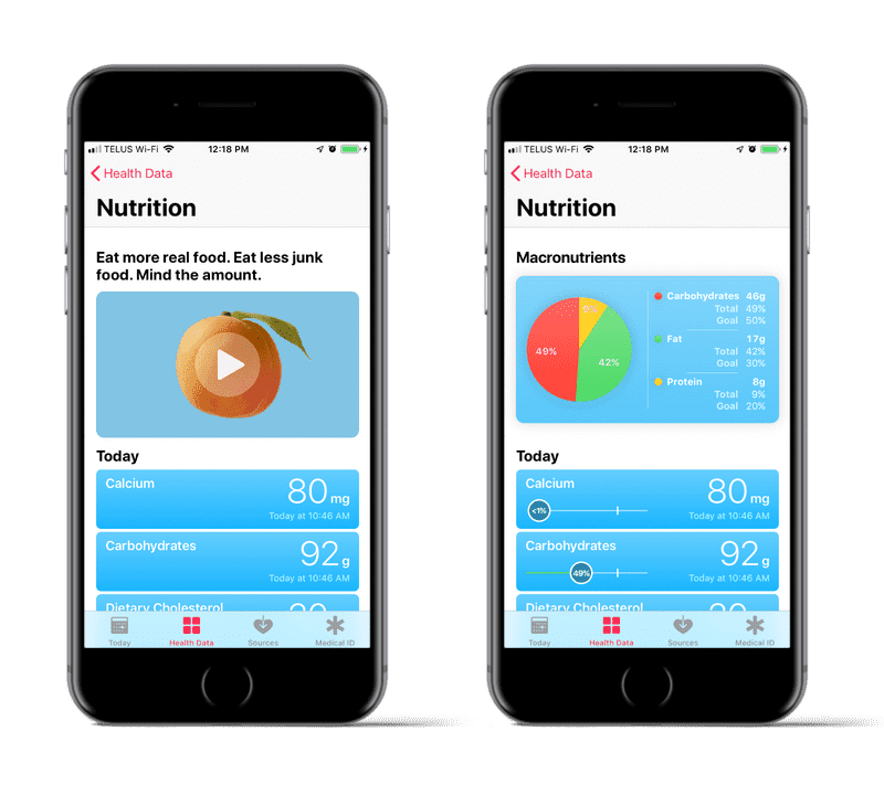
Nutrients Redesign
The current design for the Apple Health nutrients screen is a (kind of a judgemental) headline, a video, and the data. There’s no insight at all; who knows if 80mg of calcium is good or not.
For the redesign, I wanted to at least add some basic nutritional visualization. One of the most basic is displaying the proportions of macronutrients i.e. carbohydrates, fat, and protein. There are goals for the user to hit, depending on the macronutrient, so they can maybe skip the steak if they’ve disproportionately consumed protein that day so far. There’s lots that could be done but a basic visualization won’t get Apple into trouble and help their users live a more informed and healthy lifestyle.
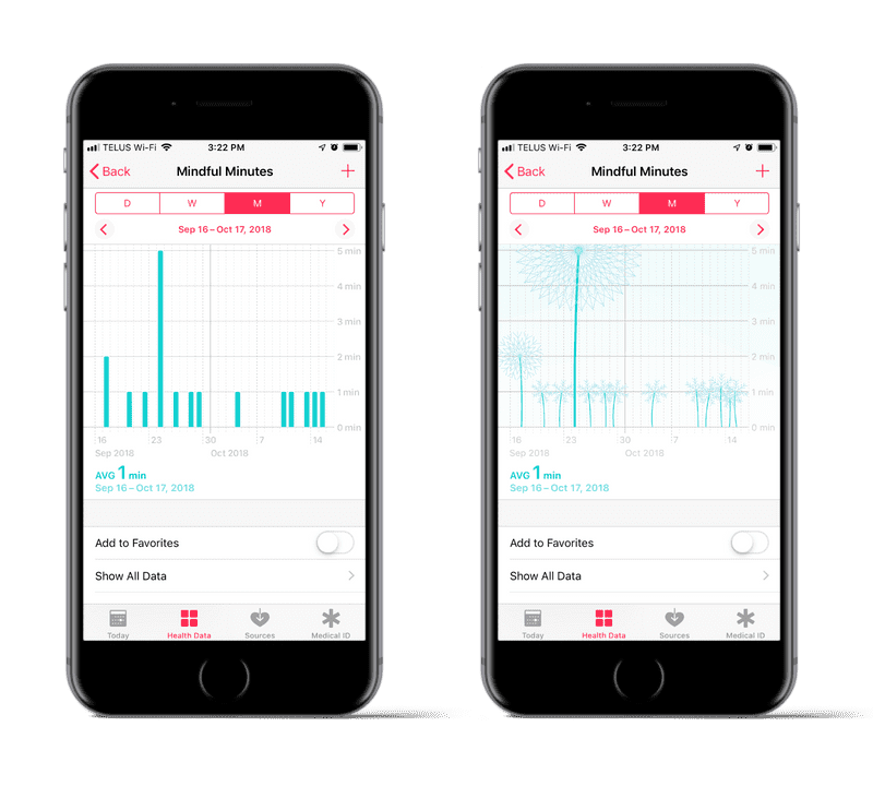
Mindfulness Minutes Redesign
The current design for the Apple Health mindful minutes screen is similar to many other data such as workouts, weight, etc. It’s the only stat in the mindfulness section of the health data is mindfulness minute, just having this generic chart isn’t very interesting.
For the redesign, I decided to replace the bars with a flower (of sorts). There are seven breaths in each “mindful minute.” As the mindful minutes increase so to does the flower’s height and pedal number by breathes.
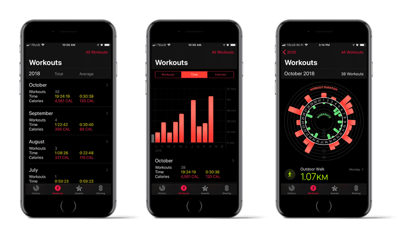
Monthly Workouts Redesign
The current design for the monthly workouts is just a glorified table view. It just lists the data for each month and an average of those data.
For the redesign, I simply added a bar graph for amount of workouts in the month, the average time of those workouts, and the calories burnt during that month. This helps the user see how much they are working out compared to other months and whether they’re achieving their workout goals to maintain health.
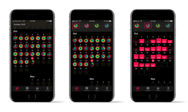
Workout History Redesign
The current design for the History tab shows whether or not the user filled the rings and whether they had a workout that day. There’s a lot of data shown but little insight.
For the redesign, I kept the all rings view and added views for each ring. This way the user can see if they workout better some days of the week, if they missed their goal that day, and if they are generally are where they want to be for each ring.
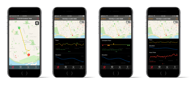
Workout Map Redesign
The current design for the workout map left something to be desired. The only thing the map has is a trail of how fast the user was moving as well as start and stop locations.
For the redesign, graphs were added below the map to give context to the workout trail. The user can also swipe a graph to see a comparison to other workouts of similar type. As the user swipes down the graph collapse to a smaller view aiding comparison between measured data.
Conclusions
The Apple Watch is one of the best smart watches available today. There are numerous stories of people improving their health through increased activity, people learning of serious heart conditions potentially saving lives, and of detecting accidental falls then contacting help.
One of the areas in which Apple has fallen short is the app experience companioning the hardware. They could help many more people reach their goals by not just displaying their data but interpreting the data to make it useful. The user had this many steps yesterday, slept an average of 7 1/2 hours last week, stood up only half as much as they should have, so what? Tell the user why that matters. Maybe then, we’d finally reach our goals.